Goo-Ryong Kang
Visual Editology
Graphic Designer
Instragram
INFO
About Me
2025
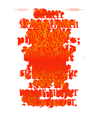
True Phoenixes
2024
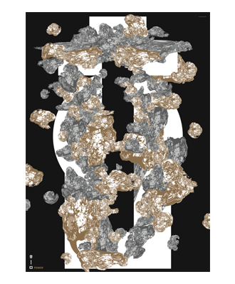
ZERO to ONE
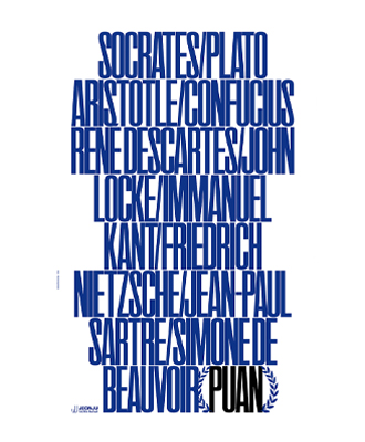
PUAN
Snow Country
2023
Time / Material: Performing Museology
2022
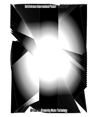
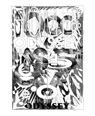
TYPOGRAPHIC ODYSSEY
2021
GANGWON TRIENNALE 2021
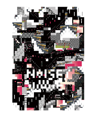
Noise/Wave
2020
Hangeul & Alphabet
Collage Series
2019
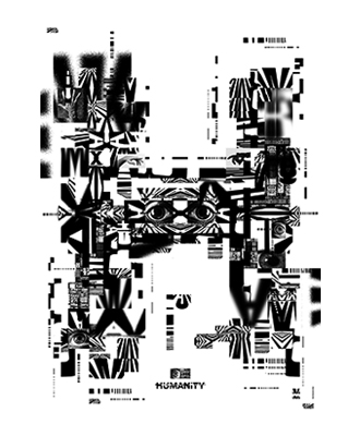
HUMANITY
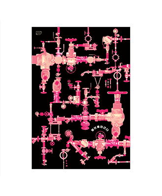
Watchout Your Valve
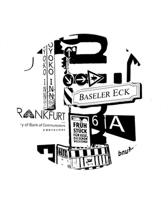
Train Travel-Germany, Switzerland, Italy
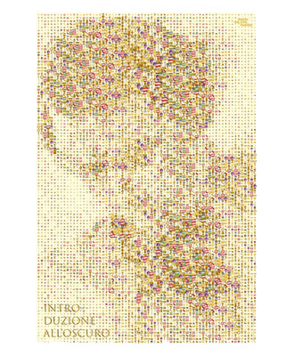
Introduzione all’oscuro
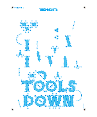
Tools Down, Pump it Up
2018
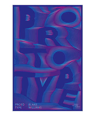
PROTOTYPE
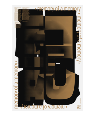
Memory of a Memory
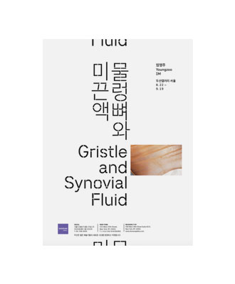
Gristle and Synovial Fluid
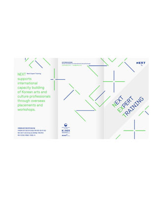
NEXT, Next Expert Training
2017
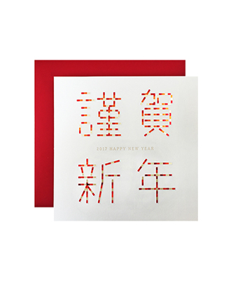
Season's Greeting Card
Welcome to Gangnam
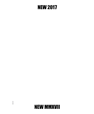
NEW 2017, NEW MMXVII
2016
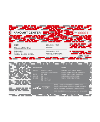
Arko Art Center Ticket
Power & Water
London Design Biennale
VOGUE 20
THE-T Vol.08
Chang Ucchin Museum of Art Membership
Typography for Yi Sang
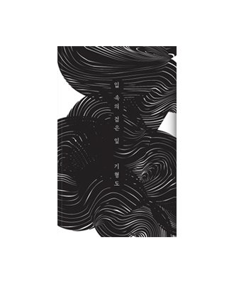
The Black Leaf in My Mouth
2015
Stylegrapher LJ
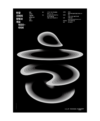
Hangul Fonts Original Form
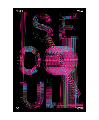
Night View of Seoul
TAE GUK KI
Interaction of X
TAE, BAEK
KOZA
Using the Eye in Order to See
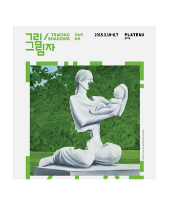
Tracing Shadows: Poster
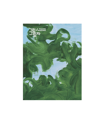
Tracing Shadows: Catalog
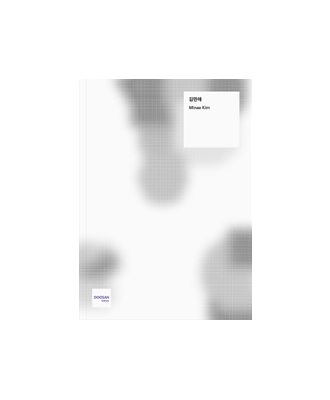
Minae Kim
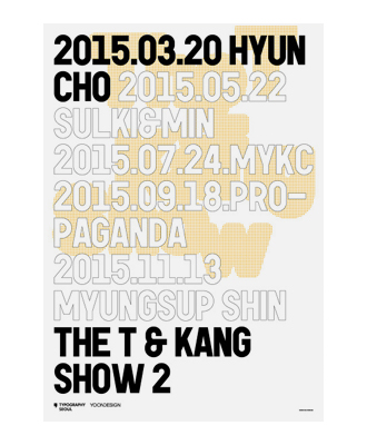
The T & Kang Show 2
2014
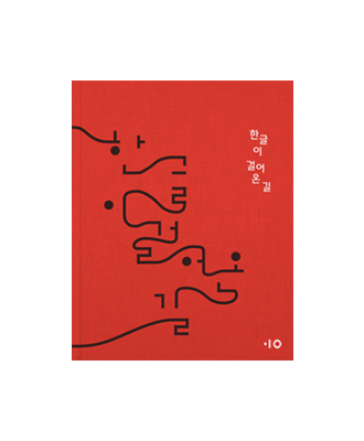
Hangeul Museum
Sojung Jun
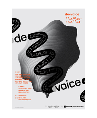
de-voice
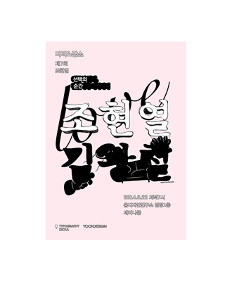
Moments of Choice
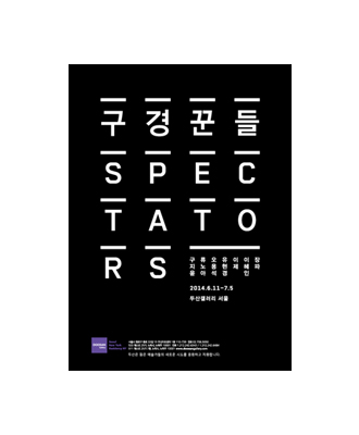
SPECTATORS
MOVE
Kang Show with The T
2014 Greeting
2013
1228
Kang Show
Come to the office
FAN
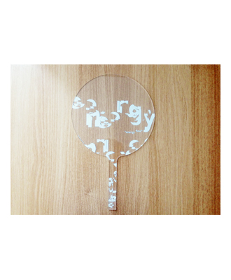
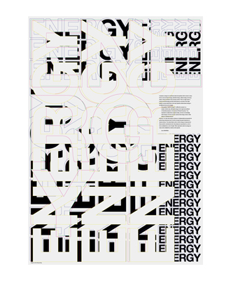
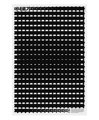
ENERGY
Blue Letter
2013
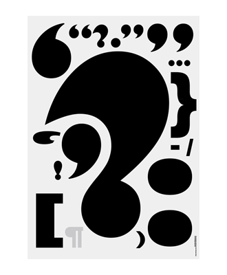
Punctuation
2012
Becoming One with Tea
Ahn Sang Soo
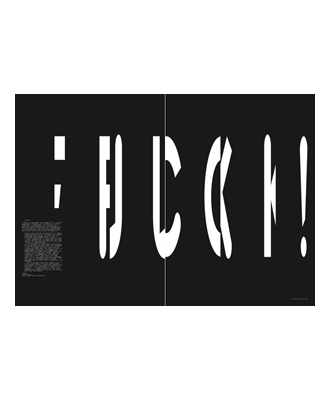
FUCK!
Kamehameha
AKIRA
Blurring
2011
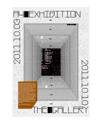
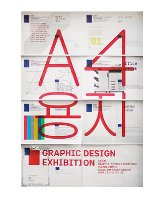
A4 Exhibition
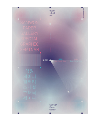
Samwon Seminar
Hana Flower
Mikyung Kim
2010
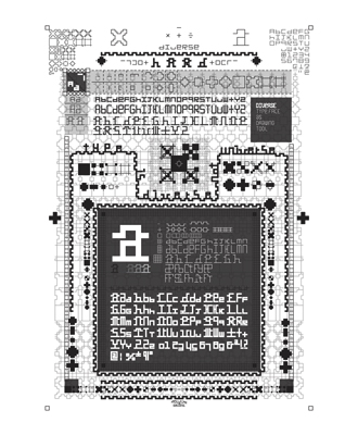
Nodes of Diversity
A4 PAPER
A4 LETTERS
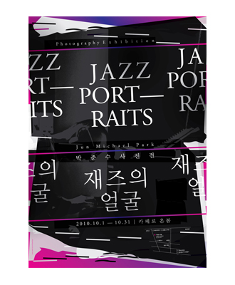
Jazz Portraits
Post Mortem
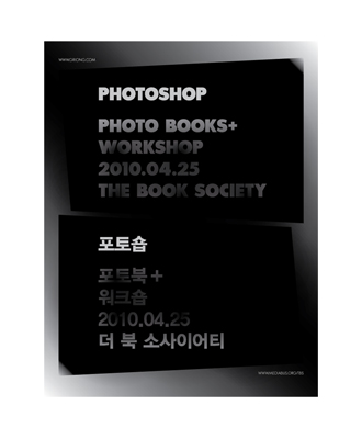
PhotoShop
100_9252–100-9305
Shipping Forecast
2009
2010 Calendar
Diverse Soft
2008
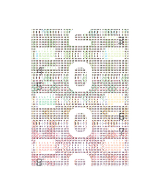
Number Calendar
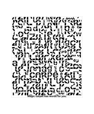
Magic Carpet
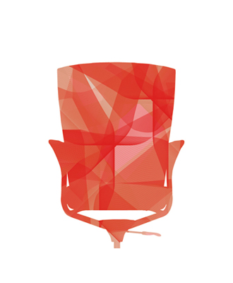
SIDIZ Poster
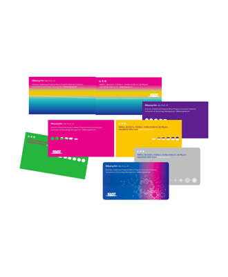
SIDIZ Banner
Diverse
2007
Designers' Light
I hate you, I like you
Good design is ____
Photography Contest
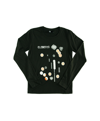
elements
Boon The Shop
2006
Invisible Cities
Trash Project
PatternView
Interview
Elevator
I diary
Publication
Designer's Secret
Wit and Design
Design Loudspeaker
© 2024
log in